Advertisement
-
Posts
1,071 -
Joined
-
Last visited
-
Days Won
151
Content Type
Profiles
Forums
Downloads
Bugs
Roadmap
Suggestions
WebFlake Changelog
FAQ
Store
Blogs
Applications
Ideas
Everything posted by WebFlake System
-
Version 1.0.18
96 downloads
This resource will give more power to Club Owners. They will be able to execute functions currently only possible in the Admin CP. Features: Add ability to create a custom HOME page for the Club Convert forums or apps categories into Club Features with a single click, so you don't need to manually move a bunch of items (topics, images, files, events, etc) - Admin CP feature. Convert Club Features into forums or categories Manage Club Features: Reorder (drag and drog) features Disable features: items from a disabled feature will not appear in the Club activity stream Delete features: just like on ACP, with option to delete content or move it to another club/category. Ability to ADMINS ban/unban members from the whole clubs. A banned member won't be able to access any club page, including its content (topics, files, images, etc.). IMPORTANT: Club items will continue to appear in Activity Streams, profiles, searchs, etc. The restriction will happen only when the member tries to read them. Allow members to choose which features will be automatically created when creating a club. Restrict number of equal features per club (example: you can only have one "topic" feature). Restrict Number of Clubs per member. Restrict Number of Clubs a member can join. Add ability to create a QUESTION feature when creating a feature from FORUMS app. Add members to the club (setting to allow Club Owners to use it. Admins can use it). Add members from a specific user group to the club (secondary groups checked) (setting to allow Club Owners to use it. Admins can use it). Change owner of the club. Change type of the club (option according to the owner group setting). Display club icons on users posts Display club icons on user profile (hover card) Settings: Allow admins/club owners to create a custom HOME page for the Club Restrict Number of Features? Number of features per club Allow Club Owners to manually ADD MEMBERS? Display 'Added By' info when admin/owner add members manually Display Club Icon on posts panel? Number of Club Icons to display Club Icons Sort Order: name, last activity and random Display Club Icons on Hovercard Profile? Number of Club Icons to display Club Icons Sort Order: name, last activity and random -
Version 11
266 downloads
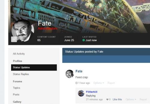
4.2x users please upgrade to version 11 which fixes an XSS vulnerability. Version 11 is 4.3 compatible. Version 8 is the last version to support 4.1.19.x or lower. Click the change log button below and select Version 8 if you need it. This plugin forces user links to display member group color/formatting. This applies in all places where the \IPS\Member object is used to produce links to a member. With Version 3, this plugin now supports Search and Stream results with some caveats. Any changes to the Core - System - searchResults template will likely break this plugin, at least as far as those pages go (but if they break you'll probably need to disable this entirely). There seem to be some systemic problems with theme hooks within this template (or at least while IN_DEV) so I needed to grab most of the template to do what needed to be done. This template needs to be fiddled with due to the fact that IPS does not use the \IPS\Member object in Search and Stream result creation but rather fetches a handful of fields from the member database directly. This results in the author/member names being dumped in as plain text and formatted with language keys. I had to force-feed group formatting into the mix and then change all the language calls to allow for html to parse correctly. You will notice that possessives are NOT formatted (i.e. Flitterkill's topic, etc...) You'll have to live with that until I get drunk enough to want to bother with accounting for possessives. It will not be "fun". On profile view, your status update name remains unformatted but replies are formatted. Also keep in mind that your user name in the cover photo and also on profile hovercards (when you cursor over a username/photo and the mini profile appears) - those usernames remain unformatted and probably should remain that way. See below. If you are wondering why some areas do not have formatted names and others do that is because there are many different ways the userlink is created throughout the suite. If the IPS\Member object is used specifically the group color will be applied automatically. In EVERY other instance additional coding is required. Sometimes easy, other times not. This remains UNSUPPORTED! You can shoot me a PM if there are problems (or if that template gets changed) but do not expect instantaneous fixes/support. -
Version 1.1.6
115 downloads
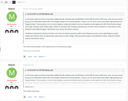
This is a simple plugin that alters the amount of text/image shown in quote boxes. The changes are purely visual, no permanent change will be done to the stored post. It is also backward compatible with older posts. And everything will be restored if the plugin is disabled/uninstalled. If you're having issues, please send me a personal message. Do NOT post it as a review, as I don't monitor those.- 1 review
-
- 1
-

-
Version 2.0.2
201 downloads
Mind theme has been updated to the latest version (v4.2.8) with a cooler look. Basic instructions are included in the package. IMPORTANT UPDATE: A series of blocks has been included in this version, so it's recommended to use PAGES App. READ MORE Hope you like Demo Demo account: User: Test Password: test- 1 review
-
- 4
-

-

-

-
Version 2.0.2
93 downloads
Omni is a unique dark that can dramatically change the look of the overall appearance with a few drop-down menus. We've included 5 default color setups in Omni along with any accent color you want. This is the first of its kind that has ever existed on XenForo, come see what makes Omni so versatile.Click the banners to view the demos, these are the default color schemes you can easily set using a simple drop-down box. -
Version 1.0.1
639 downloads
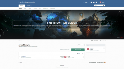
Swiper Slider Swiper Slider slider is a modern touch slider, You can add fully controllable and customizable slides, comes with a lot of options and customization's to work the way you desire. You can configure the slider to show on specific pages or exclude it anywhere you want. Features Add customer sliders. Show Records in the slider from Pages application. (New 1.0.1) Show files in the slider from Downloads application. (New 1.0.1) Truncate slider contents. Excludable from showing on any applications you have installed, You can also exclude it from showing on any "Pages" pages. Highly customizable options, Add custom slider width or auto width, Change slider height, margin's, set loop mode, Show navigation or Pagenition, Autoplay, show slider author name ..etc) Change slide effects, Texture or color overlay effects. Show slider author, Hide on mobiles and/or tablets. Set permissions for who can see/add/edit sliders. Each sliders can have different options regarding the background image and permissions. See screenshots below for more information... Slider settings- 3 reviews
-
- 14
-

-

-

-

-
Version 1.0.2
113 downloads
Notice: In order to use this expansion pack on your site, you must first install Automation Rules Synopsis The forums rules expansion brings the following important ECA's to your rules: Events: Automate site features based on forums events Saved Action used in forums ( rules can be triggered by saved actions ) Best answer set in Questions forum Best answer unset in Questions forum Conditions: Easily check for QA forums conditions Topic is in a questions/answers forum Question has a best answer set Actions: Take actions on QA forums Set a best answer for a question Unset a best answer for a question- 1 review
-
- 4
-

-
- 1 review
-
- 3
-

-

-
-
- 3 reviews
-
- 12
-

-

-

-
Version 1.0.0
112 downloads
Theme Settings Easily enable, disable or modify theme features such as background images, logos, social media links, guest messages and colors. This makes modifications and upgrades very simple since little code changes are required. Minimal HTML edits This theme has only 3 modified template files, which means in most cases, you will not need to install theme updates between IPS versions. Too easy! Color Scheme Editor Your members can choose two colors to create their own color scheme from a predefined selection. This feature can be disabled easily if required. Background picker (if enabled) Your members can choose their own background image (or color) from a predefined selection and their choice is saved via cookies. This feature can be configured or disabled within the theme settings. Global message Display a message across the top of your site with important announcements. Once your members have seen the message, they can press the Dismiss button to remove it (until you configure a new one). Guest message A customizable message can be shown to guests, prompting them to either register or login to your forum. Social links Social links can be enabled/disabled and customized to your own URL, allowing you to easily link to your social network pages (facebook, twitter, etc) HTML logo with slogan Easily add/edit your text logo and slogan from within the theme settings. If required, the text can be replaced by an image instead. Mega Footer A mega footer with configurable column numbers and content can be enabled and customized all within the theme settings. -
Version 3.3.0
774 downloads
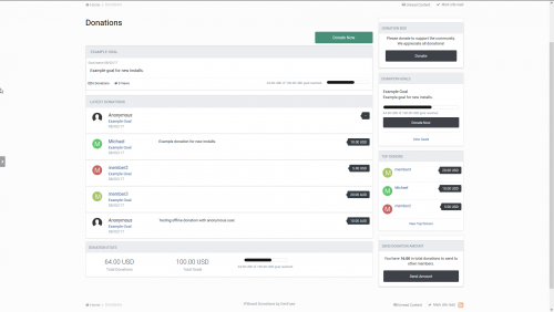
Feature List: Option to automatically demote a member back to his original member group x days after there donation. Option to mark goals as achieved and remove them from listing after they have reached 100% donations. Option to create goals that are continuous and have no set end date. RSS feeds for latest donations and latest goals listings. Ability to track the individual status of each goal as members choose to donate to there preferred goals. Setup fixed donation amounts a member can donate or let the member choose the amount. This includes a minimum donation amount allowed. Group permissions for who can view the donation tracker, view goals, view donations and for who can donate. All payment data is logged including successful and unsuccessful attempts on the payment function. New discussion topic created for each new successful donation. Ability to track the top donors in the view top donors page. Payment gateways included are: Paypal, Skrill, Payza (Alert Pay), Offline Payments and Paymentwall.- 4 reviews
-
- 14
-

-

-

-

-
Version 1.1.1
68 downloads
This is a simple plugin that alters the amount of text/image shown in quote boxes. The changes are purely visual, no permanent change will be done to the stored post. It is also backward compatible with older posts. And everything will be restored if the plugin is disabled/uninstalled. -
- 58 reviews
-
- 251
-

-

-

-

-
- 12 reviews
-
- 43
-

-

-

-
Version 1.0.1
215 downloads
This plugin allows your members to hide part of the content in their posts so other members will need to reply to the topic before being able to see the hidden content. Thanks to a powerful custom bbcode, there are no file edits required. Additionally, the plugin has an internal cache to save all the topics checked each session which will reduce the number of queries used. Thanks to that, only one additional query is used when viewing a topic and sometimes no queries at all! features No file edits (makes use of the plugins system) 2 options to specify who can bypass the reply check: Groups Members All default areas are covered: Topics (print view included) Profiles (both topics & posts tabs) Quoting replies for both ajax & non-ajax quoting (hidden content is stripped) Email notifications content remains always hidden (both forum & topic subscriptions, digests too) Easy integration with 3rd party mods that display posts (as long as the \ipsorums\topic\post class is used) New option to add your own hidden content text This is a modification of (TB) Hidden Content. If you have that installed, you must uninstall it before installing this. You must enter the content hidden in the [hide][/hide] tags you can easily make a plugin for the ckeditor reply boxes by going to admin-->customization-->editor-->toolbars then select to add a button, select custom and then name it hide content and upload what ever image you want and in the HTML section, just add [hide][/hide], now save it place it on your editor and job done easy way to use the [hide][/hide] tags, otherwise just manually enter the [hide][/hide] tags. -
Version 1.0.5
211 downloads
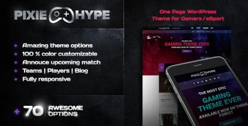
PixieHype - One page WordPress theme for Gamers/eSport PixieHype offers you the premium gaming feeling for small/big teams and organizations. We give your viewers the chance to be updated with your current upcoming matches, your teams, player roster, products and news updates. VIEW THE DEMO -
Version 3.4.9.1
21 downloads
Note: This plugin is the addon for Visual Composer Page Builder, it requires Visual Composer Page Builder to be installed and activated on your site. Some of the 3D CSS3 transition features are only available in modern browser like Chrome, Firefox, Safari, Opera or IE10+. The HotSpot element need the frontend editor enabled to drag to update the icon’s position. Included: Skew Box Help you to add 2 side by side image with text box, you can add a compare slider with it. Shadow Card Help you to add Apple TV like 3D tilt hover image, with optional caption below. Expand Grid CSS3 flex box driven design, make it responsive and expandable. Optional avatar, avatar support icon or image, icon with Visual Composer built-in Icon Picker. Auto delay slideshow Built-in gradient color style, also support customize color. Add content easily via the WordPress built-in rich text editor, help you add any HTML (like a link) easily. Optional tooltip. iHover CSS3 transition. 20 transitions for the circle, 15 transitions for the square. Both transition support left_to_right, right_to_left, top_to_bottom and bottom_to_top. Thumbnail support custom link or lightbox. Retina ready, you can choose to display the thumbnail in retina. Image Hotspot with Tooltip You can customize each hotspot icon’s postion easily in the Visual Composer Frontend editor. Hotspot icon support Font Awesome icon or numbers, numbers or single dot. Hotspot icon (and the circle dot) support any kind of color. Responsive and retina ready. Hotspot icon support pulse animation, and can be in white, gray, red, green, blue or purple. Optional open every tooltip by default when page loaded. Tooltip support any kind of content, like a image or video. Optional tooltip style: shadow, light, noir, punk. Optional tooltip animation: grow, slide, fade, fall. Optional tooltip arrow position: top, right, bottom, left, top-right, top-left, bottom-right, bottom-left. Flip Box Optional background image on both sides. Optional avatar, support circle image or icon. Avatar support circle image or icon. Icon support built-in Icon Picker after Visual Composer 4.4 Responsive and retina ready. Avatar can be on both sides or fixed on the top. Optional link for the whole element. Optional link button on the back sides. Smooth CSS3 flip transition. Gradient Box Optional avatar, avatar support icon or image, icon with Visual Composer built-in Icon Picker. Avatar (icon or image) can be in circle, rounded small, rounded large or square. Whole box can be in square, rounded small, or rounded large. Built-in gradient color style, also support customize color. Content area can be align vertically center or with padding only. Optional background color for the content area, help you make a gradient border looking. Optional icon background. Optional link for whole box. Add content easily via the WordPress built-in rich text editor, help you add any HTML (like a link) easily. Optional tooltip for whole box. Box title align can be in left, center or right. And more… Before & After Icon Picker support after Visual Composer 4.4 Optional auto delay slide. Unlimited icon color option. Built in handle style. Optional tooltip for the handle. Retina, responsive. Cube Box Optional background image on both sides. Optional avatar, support circle image or icon. Avatar support circle image or icon. Icon support built-in Icon Picker after Visual Composer 4.4 Responsive and retina ready. Optional link for the whole element. Smooth CSS3 cube transition. Parallax Optional images, text content, you can choose image or text to display first. Optional text content color, text content background, text content padding. Optional container width. Images support custom link. The parallax is disabled in the mobile view, keep the images and texts readable. Draggable Timeline Timeline label support Font Awesome icon, image or plain text only. Icon and image can be in square, round or circle shape. Auto play slideshow for the timeline. Auto scrollbar support for the long content in the timeline window. Retina ready. Optional bar color, timeline window color style, label font color. Optional drag button. Optional timeline title, timeline content. Page Transition Animation in 2 modes: normal or overlay mode. 58 different animations. Optional overlay color. Optional page in and page out animation speed. Thumbnail with Caption Thumbnails support lightbox or custom link. Auto play slideshow for the thumbnails. Retina ready and responsive. Optional caption title, caption content and button. Optional caption and button background color. Separator with Text or Icon Text or icon support link. Multiple icon, you can choose to display 1~5 same icon in a separator. Optional shape, border style (solid, dotted, dashed, gradient color), font color, background color, border color, font-family for the text, element width, margin of the whole separator etc. Fullscreen Intro Background can be in (repeat or no-repeat) image or solid color. Optional intro text, Font Awesome icon under intro text, optional font-size, font-color, font-family, intro text position. Optional click the intro text to scroll, optional element for the scorll to element, optional scroll speed, scroll offset. Optional container height. Metro Carousel and Tile You can choose to display the image in Carousel or Tile mode. Navigation button in Carousel support these position: bottom-left, bottom-center, bottom-right, top-left, top-center, and top-right. Navigation button in Carousel can be one of these 3 type: default(short line), cycle, and square. Navigation button in Carousel with 12 active color options available. Slide animation support: slide, fade, switch, or slowdown in the Carousel mode. Slide effect support: slideLeft, slideRight, slideLeftRight, slideUp, slideDown, and slideUpDown in the Tile mode. Thumbnails support lightbox or custom link in both mode. Auto play slideshow in both mode, you can customize the delay time in the editor. Retina ready and responsive. Metro UI CSS driven, include the necessary component only, keep the files lightweight. Carousel & Gallery You can choose to display the images in Carousel or Gallery. Optional dot and arrow navigation. Carousel support lightbox or custom link. Retina ready, responsive. Auto play slideshow. Optional tooltip for the thumbnails. Optional container width and max-width, align center automatically. Zoom or Magnify (image) You can choose to display the image in Zoom or Magnify mode. In Zoom mode, you can choose the control bar position, container background pattern, container width etc in the backend. Control bar can be in top, bottom, left, or right. Zoom image can be displayed in retina. In the Magnify mode, you can customize the glass radius, border size, border color, apply gray filter to the image, how to move the magnify glass(press or mouseover), customize the default position of the glass when page loaded etc. Tabs Optional tabs menu title, unlimited menu color, menu background, content color, content background. Tab menu support Font Awesome icon. 3 available tabs style. Smooth transition. Retina ready. Unlimited tabs item, content support any kind of content. Optional auto delay rotate for the tabs. Optional container width, align center automatically. CSS3 Accordion Optional accordion menu title, menu color, menu background, menu background pattern, content color, content background, font size etc. 2 available accordion style. Smooth CSS3 transition. Responsive and retina ready. Unlimited accordion item, accordion support any kind of content. Optional border. Optional container width, align center automatically. Image with Arrow Optional image, text content, content position can be in top, right, bottom or left. Optional content color, content background, font size, arrow position, Image can be opened as lightbox or custom link. Retina and responsive. Product Cover Gallery Optional cover image, cover label, label color, caption when user hover. Optional thumbnails when user hover, thumbnail can be opened in current view, lightbox or custom link. Retina and Responsive. Medium Gallery Optional layout of the Medium Gallery, you can manually set a string of numbers to specify the number of images each row contains in the gallery. Optional gallery width, gutter, title and alt for the image in the Medium Gallery. Optional ribbon label, ribbon link, position, ribbon background, ribbon color, image link etc in the Ribbon add-on. Retina and Responsive. To Do List or Price Table You can customize it to a to do list or price table. Optional front-end only interactive for the to do list. Font Awesome icon 4.2, optional color for each icon. Responsive and retina ready. Optional header text, color, background, background pattern. Unlimited item list. Optional label divider inside the list. Optional button under the item list. Optional divide each item with background or border. Figure Navigation Optional figure label, background, color, border color, title, description and font size etc. Support other VC shortcode, for example you can put the VC buttons inside the content. Optional background image for each block, you can choose the image repeat or not. Optional header image and image size. Retina, you can choose to display the header image in retina or not. Optional block height, block background. Optional display which block by default. Stack Gallery Optional image, optional image size, image border, optional retina image. Optional tooltip for each image. Optional ease in and ease out animation. Retina and responsive. Optional arrow navigation, optional arrow color (white/black). Optional container height, container background. Optional auto delay slideshow, and the delay second. Testimonial Carousel Optional avatar, optional avatar size and CSS margin, optional retina avatar, optional link for each avatar. Optional testimonial number to be displayed by default. Optional testimonial width, background and text color, font-family, font-style and font-size. Optional auto play and the slideshow delay second. Optional infinite loop for the carousel. Font Awesome icon support. Responsive and retina ready. Optional icon size, color, position. Masonry Gallery Responsive grid. Optional thumbnail width, thumbnail padding, container offset, minWidth of the lightbox image. Thumbnail support lightbox, custom link, thumbnail image can be in retina. Scrolling Notification CSS3 transition (driven by animate.css, with 20+ transition options) for the popup notification. Optional popup window background, text color, width and margin top. Notification can be in any position of the page, for example, upper left, upper right, bottom left, bottom right etc. Multiple notification, you can add a unique notification for each post or page. Optional opacity, position, color, animation style and cookie feature for the notification. DA (Direction-Aware) Gallery 3D hover effect. Optional gallery width, thumbnail width, thumbnail margin, caption (thumbnail title and description). Optional caption color, caption background, opacity. Thumbnail support lightbox, custom link, thumbnail image can be in retina. App Mockup Gallery CSS3 3D effect for the thumbnails. Optional thumbnail width, height, container offset, tooltip. Thumbnail support lightbox or custom link. Optional gradient background. Optional retina thumbnail. Font Awesome Animation Support all Font Awesome icon. Optional icon size, icon animation, icon color, icon float. And more.. Included Depth Modal, Profile Card, Fluidbox, Ribbon, Animate Button 01 etc, which are all in simple design, and help you to add an eye catching effect to your site. -
Version 3.16.9
16 downloads
Extend Visual Composer and add more power to it! This plugin adds several premium elements in your Visual Composer on top of the built-in ones given by WPBakery. Every single element in the package is crafted with utmost attention to details and a simple objective to provide you an ultimate experience. We’ve put a lot of time and care to ensure that all the elements are flexible so that they will open limitless possibilities for you, while maintaining simplicity at the core. This plugin is the addon for Visual Composer Page Builder Addon Elements – Icons – You can use this element to integrate a simple icon (font & image, both kinds) in your page and use it as you want. Or you can utilize Visual Composer grids and display a list of logos of your clients, partners, sponsors, etc. Info Box – Perhaps, the most popular trend right now, Info Boxes truly make your website stand out helping you highlight the important things you have on offer. Info List – Traditional HTML lists are boring, aren’t they? This elements simply re-imagines the lists. You may take an opportunity and utilize it’s cool design to show some process or simply highlight your most popular / related products, services & features. Flip Box - This element combines the power of “Info Box” & “Call to Action” block altogether. On the front, it would look like a normal Info Box but as visitor hovers on the block, it flips with a cool CSS3 effect and shows a Call to Action section, provoking him to take a call. Counter - Want to show your milestones, achievements and any other numeric statistics with animated numbers? This element will help! Interactive Banner - Many times, image banners come in handy as they are very convenient and obvious way to deliver your message precisely. This element will display those image blocks in a nicer & interactive way. Modal Popup Box – This is one of the very useful element that can go on any website. Create modal popup boxes and embed anything you wish inside the popup box through easy WYSIWYG editor. Timeline – Display a timeline in a Facebook style or simply showcase your features, process or highlights little creatively. We have taken special efforts with custom JavaScript & CSS codes to make it as perfect as possible. Extended Google Maps – Visual Composer comes with Google Maps element by default. But our Extended Googles Maps element uses latest APIs and allows you to do more with it. Upload marker images, write custom HTML in map info box and control everything that goes with map. Row Backgrounds - Creative backgrounds do truly set the tone for your website. So we offer you easy tools that will help you utilize them quickly. Features – Fixed Image Background - Keeps the image fixed at it’s position while the other content moves on scroll. Vertical & Horizontal Parallax - The background moves at different speed & direction from your content on scroll. Hover Parallax - The background moves creatively with cursor movement. Video Background - - Plays a video in the background. Supports hosted as well as YouTube videos. Multilayer Hover Parallax - - Design a real 3D parallax. Go ahead – impress your users While we believe the above six elements will benefit your site immediately, these are not really all! We’re already working on few more elements that we look forward including in this plugin as we complete them. We want to make this plugin as an “ultimate” source for you to get most of the essential Visual Composer addon elements in one package. The long wait has finally come to an end…Introducing, WordPress Icon Fonts Manager! This project was originally started with a slightly different objective of developing a functionality that will help people use the Icon Fonts in their WordPress site easily. But then, we realized – providing just the Icon Fonts functionality wasn’t enough to make it go. There was a need to make Icon Fonts even more intuitive for normal WordPress users and that’s when we decided to develop several Visual Composer element that will make usage of Icon Fonts even easier. So – “Ultimate Visual Composer Addons” is technically an extension of two things; firstly of our Icon Font Manager and secondly, the obvious one – Visual Composer Features of the Icon Fonts Manager - Customize Your Own Icon Fonts – We understand you don’t use all those hundreds of prebuilt unnecessary icons that come with any of those popular libraries like Font Awesome, Entypo, etc; but you care more about only the few ones that relate to your business more. That’s why, we’ve made our Icon Fonts Manager very compatible with the famous IcoMoon’s APIs where you can create your own customize font by shortlisting your favorite icons from the choice of 2500+ icons! If those 2500+ icons still fall short, IcoMoon will still cover you with their amazing feature that helps you convert your SVG designs in the Icon Fonts. Real Time Icon Search - Okay, many of us would like big numbers & more choices of icons, wouldn’t we? Though this choice is really very fancy, it certainly comes with a pain as we can’t easily find the icon that we are looking for when we need it. And that’s why we have integrated a real time search feature which can help you sort through all the Icon Fonts you have in your library very smartly. More features on the way! As said earlier – Icon Fonts Manager is our individual, long term project; and we look forward adding more features in it with time such as integration with WordPress’s Menu, TinyMCE editor, etc. When these features will be developed – they will be provided in this plugin as well. After working so hard on this plugin for last few weeks, we believe we have “nailed it”, and have come up with a truly essential solution that would benefit all the Visual Composer users. We fancy the Icon Fonts Manager part of this plugin very much as well and hope that you will love it as much as we do! Minimum Requirements WordPress 4.3 and above Visual Composer 4.8 or great version (Latest version is advised) If you have got Visual Composer as a part of your theme, ensure that Core Visual Composer plugin is not heavily modified cURL must be enabled on your server -
-
- 28 reviews
-
- 139
-

-

-

-

-

-

-
-
Version 15.02.2017
254 downloads
Can be used for nulled and original. Two security issues have been identified in IP.Board 3.4.x. Unauthorized users may be able to issue warnings, and users may be able to obtain certain member information if they know the member's linked Facebook account ID. To resolve this issue, please download this patch and apply it to your site. -
Version 1.0.2
408 downloads
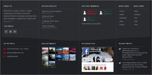
Advanced footer allows you to add a footer to your site with many blocks including Facebook feed, Twitter feed, Gallery images, Articles feed, Staff members, Custom blocks and more, Beautiful and clean design it is fully responsive and perfectly suits your theme due to its highly customizable options. Advanced footer is featured with two row layouts with multiple columns it has a unique design with a lot of options, Footer blocks are entirely customizable, resizable, and reorderable. __________________________________________________________ Features: Up to 10 blocks and more in feature updates Blocks: About us, Staff members, Social links, Get in touch, Quick links, Twitter feed, facebook feed, Custom block templates for gallery images and articles, two Custom blocks. Custom color options. / or Match colors to your theme. Resizable and reorderable blocks. Highly customizable options. Super clean and fully responsive design. -
Version 8.0.0
377 downloads
This plugin forces user links to display member group color/formatting. This applies in all places where the \IPS\Member object is used to produce links to a member. With Version 3, this plugin now supports Search and Stream results with some caveats. Any changes to the Core - System - searchResults template will likely break this plugin, at least as far as those pages go (but if they break you'll probably need to disable this entirely). There seem to be some systemic problems with theme hooks within this template (or at least while IN_DEV) so I needed to grab most of the template to do what needed to be done. This template needs to be fiddled with due to the fact that IPS does not use the \IPS\Member object in Search and Stream result creation but rather fetches a handful of fields from the member database directly. This results in the author/member names being dumped in as plain text and formatted with language keys. I had to force-feed group formatting into the mix and then change all the language calls to allow for html to parse correctly. You will notice that possessives are NOT formatted (i.e. Flitterkill's topic, etc...) You'll have to live with that until I get drunk enough to want to bother with accounting for possessives. It will not be "fun". On profile view, your status update name remains unformatted but replies are formatted. Also keep in mind that your user name in the cover photo and also on profile hovercards (when you cursor over a username/photo and the mini profile appears) - those usernames remain unformatted and probably should remain that way. See below. This remains UNSUPPORTED! You can shoot me a PM if there are problems (or if that template gets changed) but do not expect instantaneous fixes/support.- 1 review
-
- 3
-


