Advertisement


mr-pimpen
-
Posts
1,296 -
Joined
-
Last visited
-
Days Won
81
Content Type
Profiles
Forums
Downloads
Bugs
Roadmap
Suggestions
WebFlake Changelog
FAQ
Store
Blogs
Applications
Ideas
Everything posted by mr-pimpen
-
thanks for the approval for clear notifications
-
i removed the bottom portion and know it should be ok if you feel that its a issue just put the codes in your css theme thanks for point en that out
-
was removed got it to work with out the bottom portion
-
that's the java scrips to run the animation my site is not bad i have the paid version of ipb its not nulled and i do scan my site on my server are you using ipb or something elese
-
add this to you theme just change the 1 and the 62 css div[class*="cStaffDirectory"] [href*="/compose/?to=1"], div[class*="cStaffDirectory"] [href*="/compose/?to=62"] { display: none; }

-
what are you talking about
-
want to change the icons on the userbar just add these codes choose any theme you want and go to userbar and add the codes look for and just change it to what ever your forums are you can all so do this for The Home icon in breadcrumbs <strong><i class='fa fa-plus'></i> <i class="fa fa-bullhorn faa-wrench animated" style="font-size: 1.33333333em;line-height: 0.1em;vertical-align: -15%;color: SlateBlue;"></i><i class="material-icons">Report</i> in order to work as animated you have to add this to css /*! * font-awesome-animation - v0.0.10 * https://github.com/l-lin/font-awesome-animation * License: MIT */ @-webkit-keyframes wrench { 0% { -webkit-transform: rotate(-12deg); transform: rotate(-12deg); } 8% { -webkit-transform: rotate(12deg); transform: rotate(12deg); } 10% { -webkit-transform: rotate(24deg); transform: rotate(24deg); } 18% { -webkit-transform: rotate(-24deg); transform: rotate(-24deg); } 20% { -webkit-transform: rotate(-24deg); transform: rotate(-24deg); } 28% { -webkit-transform: rotate(24deg); transform: rotate(24deg); } 30% { -webkit-transform: rotate(24deg); transform: rotate(24deg); } 38% { -webkit-transform: rotate(-24deg); transform: rotate(-24deg); } 40% { -webkit-transform: rotate(-24deg); transform: rotate(-24deg); } 48% { -webkit-transform: rotate(24deg); transform: rotate(24deg); } 50% { -webkit-transform: rotate(24deg); transform: rotate(24deg); } 58% { -webkit-transform: rotate(-24deg); transform: rotate(-24deg); } 60% { -webkit-transform: rotate(-24deg); transform: rotate(-24deg); } 68% { -webkit-transform: rotate(24deg); transform: rotate(24deg); } 75%, 100% { -webkit-transform: rotate(0deg); transform: rotate(0deg); } } @keyframes wrench { 0% { -webkit-transform: rotate(-12deg); -ms-transform: rotate(-12deg); transform: rotate(-12deg); } 8% { -webkit-transform: rotate(12deg); -ms-transform: rotate(12deg); transform: rotate(12deg); } 10% { -webkit-transform: rotate(24deg); -ms-transform: rotate(24deg); transform: rotate(24deg); } 18% { -webkit-transform: rotate(-24deg); -ms-transform: rotate(-24deg); transform: rotate(-24deg); } 20% { -webkit-transform: rotate(-24deg); -ms-transform: rotate(-24deg); transform: rotate(-24deg); } 28% { -webkit-transform: rotate(24deg); -ms-transform: rotate(24deg); transform: rotate(24deg); } 30% { -webkit-transform: rotate(24deg); -ms-transform: rotate(24deg); transform: rotate(24deg); } 38% { -webkit-transform: rotate(-24deg); -ms-transform: rotate(-24deg); transform: rotate(-24deg); } 40% { -webkit-transform: rotate(-24deg); -ms-transform: rotate(-24deg); transform: rotate(-24deg); } 48% { -webkit-transform: rotate(24deg); -ms-transform: rotate(24deg); transform: rotate(24deg); } 50% { -webkit-transform: rotate(24deg); -ms-transform: rotate(24deg); transform: rotate(24deg); } 58% { -webkit-transform: rotate(-24deg); -ms-transform: rotate(-24deg); transform: rotate(-24deg); } 60% { -webkit-transform: rotate(-24deg); -ms-transform: rotate(-24deg); transform: rotate(-24deg); } 68% { -webkit-transform: rotate(24deg); -ms-transform: rotate(24deg); transform: rotate(24deg); } 75%, 100% { -webkit-transform: rotate(0deg); -ms-transform: rotate(0deg); transform: rotate(0deg); } } .faa-wrench.animated, .faa-wrench.animated-hover:hover, .faa-parent.animated-hover:hover > .faa-wrench { -webkit-animation: wrench 2.5s ease infinite; animation: wrench 2.5s ease infinite; transform-origin-x: 90%; transform-origin-y: 35%; transform-origin-z: initial; } .faa-wrench.animated.faa-fast, .faa-wrench.animated-hover.faa-fast:hover, .faa-parent.animated-hover:hover > .faa-wrench.faa-fast { -webkit-animation: wrench 1.2s ease infinite; animation: wrench 1.2s ease infinite; } .faa-wrench.animated.faa-slow, .faa-wrench.animated-hover.faa-slow:hover, .faa-parent.animated-hover:hover > .faa-wrench.faa-slow { -webkit-animation: wrench 3.7s ease infinite; animation: wrench 3.7s ease infinite; } /* BELL */ @-webkit-keyframes ring { 0% { -webkit-transform: rotate(-15deg); transform: rotate(-15deg); } 2% { -webkit-transform: rotate(15deg); transform: rotate(15deg); } 4% { -webkit-transform: rotate(-18deg); transform: rotate(-18deg); } 6% { -webkit-transform: rotate(18deg); transform: rotate(18deg); } 8% { -webkit-transform: rotate(-22deg); transform: rotate(-22deg); } 10% { -webkit-transform: rotate(22deg); transform: rotate(22deg); } 12% { -webkit-transform: rotate(-18deg); transform: rotate(-18deg); } 14% { -webkit-transform: rotate(18deg); transform: rotate(18deg); } 16% { -webkit-transform: rotate(-12deg); transform: rotate(-12deg); } 18% { -webkit-transform: rotate(12deg); transform: rotate(12deg); } 20%, 100% { -webkit-transform: rotate(0deg); transform: rotate(0deg); } } @keyframes ring { 0% { -webkit-transform: rotate(-15deg); -ms-transform: rotate(-15deg); transform: rotate(-15deg); } 2% { -webkit-transform: rotate(15deg); -ms-transform: rotate(15deg); transform: rotate(15deg); } 4% { -webkit-transform: rotate(-18deg); -ms-transform: rotate(-18deg); transform: rotate(-18deg); } 6% { -webkit-transform: rotate(18deg); -ms-transform: rotate(18deg); transform: rotate(18deg); } 8% { -webkit-transform: rotate(-22deg); -ms-transform: rotate(-22deg); transform: rotate(-22deg); } 10% { -webkit-transform: rotate(22deg); -ms-transform: rotate(22deg); transform: rotate(22deg); } 12% { -webkit-transform: rotate(-18deg); -ms-transform: rotate(-18deg); transform: rotate(-18deg); } 14% { -webkit-transform: rotate(18deg); -ms-transform: rotate(18deg); transform: rotate(18deg); } 16% { -webkit-transform: rotate(-12deg); -ms-transform: rotate(-12deg); transform: rotate(-12deg); } 18% { -webkit-transform: rotate(12deg); -ms-transform: rotate(12deg); transform: rotate(12deg); } 20%, 100% { -webkit-transform: rotate(0deg); -ms-transform: rotate(0deg); transform: rotate(0deg); } } .faa-ring.animated, .faa-ring.animated-hover:hover, .faa-parent.animated-hover:hover > .faa-ring { -webkit-animation: ring 2s ease infinite; animation: ring 2s ease infinite; transform-origin-x: 50%; transform-origin-y: 0px; transform-origin-z: initial; } .faa-ring.animated.faa-fast, .faa-ring.animated-hover.faa-fast:hover, .faa-parent.animated-hover:hover > .faa-ring.faa-fast { -webkit-animation: ring 1s ease infinite; animation: ring 1s ease infinite; } .faa-ring.animated.faa-slow, .faa-ring.animated-hover.faa-slow:hover, .faa-parent.animated-hover:hover > .faa-ring.faa-slow { -webkit-animation: ring 3s ease infinite; animation: ring 3s ease infinite; } /* VERTICAL */ @-webkit-keyframes vertical { 0% { -webkit-transform: translate(0,-3px); transform: translate(0,-3px); } 4% { -webkit-transform: translate(0,3px); transform: translate(0,3px); } 8% { -webkit-transform: translate(0,-3px); transform: translate(0,-3px); } 12% { -webkit-transform: translate(0,3px); transform: translate(0,3px); } 16% { -webkit-transform: translate(0,-3px); transform: translate(0,-3px); } 20% { -webkit-transform: translate(0,3px); transform: translate(0,3px); } 22%, 100% { -webkit-transform: translate(0,0); transform: translate(0,0); } } @keyframes vertical { 0% { -webkit-transform: translate(0,-3px); -ms-transform: translate(0,-3px); transform: translate(0,-3px); } 4% { -webkit-transform: translate(0,3px); -ms-transform: translate(0,3px); transform: translate(0,3px); } 8% { -webkit-transform: translate(0,-3px); -ms-transform: translate(0,-3px); transform: translate(0,-3px); } 12% { -webkit-transform: translate(0,3px); -ms-transform: translate(0,3px); transform: translate(0,3px); } 16% { -webkit-transform: translate(0,-3px); -ms-transform: translate(0,-3px); transform: translate(0,-3px); } 20% { -webkit-transform: translate(0,3px); -ms-transform: translate(0,3px); transform: translate(0,3px); } 22%, 100% { -webkit-transform: translate(0,0); -ms-transform: translate(0,0); transform: translate(0,0); } } .faa-vertical.animated, .faa-vertical.animated-hover:hover, .faa-parent.animated-hover:hover > .faa-vertical { -webkit-animation: vertical 2s ease infinite; animation: vertical 2s ease infinite; } .faa-vertical.animated.faa-fast, .faa-vertical.animated-hover.faa-fast:hover, .faa-parent.animated-hover:hover > .faa-vertical.faa-fast { -webkit-animation: vertical 1s ease infinite; animation: vertical 1s ease infinite; } .faa-vertical.animated.faa-slow, .faa-vertical.animated-hover.faa-slow:hover, .faa-parent.animated-hover:hover > .faa-vertical.faa-slow { -webkit-animation: vertical 4s ease infinite; animation: vertical 4s ease infinite; } /* HORIZONTAL */ @-webkit-keyframes horizontal { 0% { -webkit-transform: translate(0,0); transform: translate(0,0); } 6% { -webkit-transform: translate(5px,0); transform: translate(5px,0); } 12% { -webkit-transform: translate(0,0); transform: translate(0,0); } 18% { -webkit-transform: translate(5px,0); transform: translate(5px,0); } 24% { -webkit-transform: translate(0,0); transform: translate(0,0); } 30% { -webkit-transform: translate(5px,0); transform: translate(5px,0); } 36%, 100% { -webkit-transform: translate(0,0); transform: translate(0,0); } } @keyframes horizontal { 0% { -webkit-transform: translate(0,0); -ms-transform: translate(0,0); transform: translate(0,0); } 6% { -webkit-transform: translate(5px,0); -ms-transform: translate(5px,0); transform: translate(5px,0); } 12% { -webkit-transform: translate(0,0); -ms-transform: translate(0,0); transform: translate(0,0); } 18% { -webkit-transform: translate(5px,0); -ms-transform: translate(5px,0); transform: translate(5px,0); } 24% { -webkit-transform: translate(0,0); -ms-transform: translate(0,0); transform: translate(0,0); } 30% { -webkit-transform: translate(5px,0); -ms-transform: translate(5px,0); transform: translate(5px,0); } 36%, 100% { -webkit-transform: translate(0,0); -ms-transform: translate(0,0); transform: translate(0,0); } } .faa-horizontal.animated, .faa-horizontal.animated-hover:hover, .faa-parent.animated-hover:hover > .faa-horizontal { -webkit-animation: horizontal 2s ease infinite; animation: horizontal 2s ease infinite; } .faa-horizontal.animated.faa-fast, .faa-horizontal.animated-hover.faa-fast:hover, .faa-parent.animated-hover:hover > .faa-horizontal.faa-fast { -webkit-animation: horizontal 1s ease infinite; animation: horizontal 1s ease infinite; } .faa-horizontal.animated.faa-slow, .faa-horizontal.animated-hover.faa-slow:hover, .faa-parent.animated-hover:hover > .faa-horizontal.faa-slow { -webkit-animation: horizontal 3s ease infinite; animation: horizontal 3s ease infinite; } /* FLASHING */ @-webkit-keyframes flash { 0%, 100%, 50% { opacity: 1; } 25%, 75% { opacity: 0; } } @keyframes flash { 0%, 100%, 50% { opacity: 1; } 25%, 75% { opacity: 0; } } .faa-flash.animated, .faa-flash.animated-hover:hover, .faa-parent.animated-hover:hover > .faa-flash { -webkit-animation: flash 2s ease infinite; animation: flash 2s ease infinite; } .faa-flash.animated.faa-fast, .faa-flash.animated-hover.faa-fast:hover, .faa-parent.animated-hover:hover > .faa-flash.faa-fast { -webkit-animation: flash 1s ease infinite; animation: flash 1s ease infinite; } .faa-flash.animated.faa-slow, .faa-flash.animated-hover.faa-slow:hover, .faa-parent.animated-hover:hover > .faa-flash.faa-slow { -webkit-animation: flash 3s ease infinite; animation: flash 3s ease infinite; } /* BOUNCE */ @-webkit-keyframes bounce { 0%, 10%, 20%, 50%, 80%, 100% { -webkit-transform: translateY(0); transform: translateY(0); } 40% { -webkit-transform: translateY(-15px); transform: translateY(-15px); } 60% { -webkit-transform: translateY(-15px); transform: translateY(-15px); } } @keyframes bounce { 0%, 10%, 20%, 50%, 80%, 100% { -webkit-transform: translateY(0); -ms-transform: translateY(0); transform: translateY(0); } 40% { -webkit-transform: translateY(-15px); -ms-transform: translateY(-15px); transform: translateY(-15px); } 60% { -webkit-transform: translateY(-15px); -ms-transform: translateY(-15px); transform: translateY(-15px); } } .faa-bounce.animated, .faa-bounce.animated-hover:hover, .faa-parent.animated-hover:hover > .faa-bounce { -webkit-animation: bounce 2s ease infinite; animation: bounce 2s ease infinite; } .faa-bounce.animated.faa-fast, .faa-bounce.animated-hover.faa-fast:hover, .faa-parent.animated-hover:hover > .faa-bounce.faa-fast { -webkit-animation: bounce 1s ease infinite; animation: bounce 1s ease infinite; } .faa-bounce.animated.faa-slow, .faa-bounce.animated-hover.faa-slow:hover, .faa-parent.animated-hover:hover > .faa-bounce.faa-slow { -webkit-animation: bounce 3s ease infinite; animation: bounce 3s ease infinite; } /* SPIN */ @-webkit-keyframes spin { 0% { -webkit-transform: rotate(0deg); transform: rotate(0deg); } 100% { -webkit-transform: rotate(359deg); transform: rotate(359deg); } } @keyframes spin { 0% { -webkit-transform: rotate(0deg); -ms-transform: rotate(0deg); transform: rotate(0deg); } 100% { -webkit-transform: rotate(359deg); -ms-transform: rotate(359deg); transform: rotate(359deg); } } .faa-spin.animated, .faa-spin.animated-hover:hover, .faa-parent.animated-hover:hover > .faa-spin { -webkit-animation: spin 1.5s linear infinite; animation: spin 1.5s linear infinite; } .faa-spin.animated.faa-fast, .faa-spin.animated-hover.faa-fast:hover, .faa-parent.animated-hover:hover > .faa-spin.faa-fast { -webkit-animation: spin 0.7s linear infinite; animation: spin 0.7s linear infinite; } .faa-spin.animated.faa-slow, .faa-spin.animated-hover.faa-slow:hover, .faa-parent.animated-hover:hover > .faa-spin.faa-slow { -webkit-animation: spin 2.2s linear infinite; animation: spin 2.2s linear infinite; } /* FLOAT */ @-webkit-keyframes float { 0% { -webkit-transform: translateY(0); transform: translateY(0); } 50% { -webkit-transform: translateY(-6px); transform: translateY(-6px); } 100% { -webkit-transform: translateY(0); transform: translateY(0); } } @keyframes float { 0% { -webkit-transform: translateY(0); -ms-transform: translateY(0); transform: translateY(0); } 50% { -webkit-transform: translateY(-6px); -ms-transform: translateY(-6px); transform: translateY(-6px); } 100% { -webkit-transform: translateY(0); -ms-transform: translateY(0); transform: translateY(0); } } .faa-float.animated, .faa-float.animated-hover:hover, .faa-parent.animated-hover:hover > .faa-float { -webkit-animation: float 2s linear infinite; animation: float 2s linear infinite; } .faa-float.animated.faa-fast, .faa-float.animated-hover.faa-fast:hover, .faa-parent.animated-hover:hover > .faa-float.faa-fast { -webkit-animation: float 1s linear infinite; animation: float 1s linear infinite; } .faa-float.animated.faa-slow, .faa-float.animated-hover.faa-slow:hover, .faa-parent.animated-hover:hover > .faa-float.faa-slow { -webkit-animation: float 3s linear infinite; animation: float 3s linear infinite; } /* PULSE */ @-webkit-keyframes pulse { 0% { -webkit-transform: scale(1.1); transform: scale(1.1); } 50% { -webkit-transform: scale(0.8); transform: scale(0.8); } 100% { -webkit-transform: scale(1.1); transform: scale(1.1); } } @keyframes pulse { 0% { -webkit-transform: scale(1.1); -ms-transform: scale(1.1); transform: scale(1.1); } 50% { -webkit-transform: scale(0.8); -ms-transform: scale(0.8); transform: scale(0.8); } 100% { -webkit-transform: scale(1.1); -ms-transform: scale(1.1); transform: scale(1.1); } } .faa-pulse.animated, .faa-pulse.animated-hover:hover, .faa-parent.animated-hover:hover > .faa-pulse { -webkit-animation: pulse 2s linear infinite; animation: pulse 2s linear infinite; } .faa-pulse.animated.faa-fast, .faa-pulse.animated-hover.faa-fast:hover, .faa-parent.animated-hover:hover > .faa-pulse.faa-fast { -webkit-animation: pulse 1s linear infinite; animation: pulse 1s linear infinite; } .faa-pulse.animated.faa-slow, .faa-pulse.animated-hover.faa-slow:hover, .faa-parent.animated-hover:hover > .faa-pulse.faa-slow { -webkit-animation: pulse 3s linear infinite; animation: pulse 3s linear infinite; } /* SHAKE */ .faa-shake.animated, .faa-shake.animated-hover:hover, .faa-parent.animated-hover:hover > .faa-shake { -webkit-animation: wrench 2.5s ease infinite; animation: wrench 2.5s ease infinite; } .faa-shake.animated.faa-fast, .faa-shake.animated-hover.faa-fast:hover, .faa-parent.animated-hover:hover > .faa-shake.faa-fast { -webkit-animation: wrench 1.2s ease infinite; animation: wrench 1.2s ease infinite; } .faa-shake.animated.faa-slow, .faa-shake.animated-hover.faa-slow:hover, .faa-parent.animated-hover:hover > .faa-shake.faa-slow { -webkit-animation: wrench 3.7s ease infinite; animation: wrench 3.7s ease infinite; } /* TADA */ @-webkit-keyframes tada { 0% { -webkit-transform: scale(1); transform: scale(1); } 10%, 20% { -webkit-transform: scale(.9) rotate(-8deg); transform: scale(.9) rotate(-8deg); } 30%, 50%, 70% { -webkit-transform: scale(1.3) rotate(8deg); transform: scale(1.3) rotate(8deg); } 40%, 60% { -webkit-transform: scale(1.3) rotate(-8deg); transform: scale(1.3) rotate(-8deg); } 80%, 100% { -webkit-transform: scale(1) rotate(0); transform: scale(1) rotate(0); } } @keyframes tada { 0% { -webkit-transform: scale(1); -ms-transform: scale(1); transform: scale(1); } 10%, 20% { -webkit-transform: scale(.9) rotate(-8deg); -ms-transform: scale(.9) rotate(-8deg); transform: scale(.9) rotate(-8deg); } 30%, 50%, 70% { -webkit-transform: scale(1.3) rotate(8deg); -ms-transform: scale(1.3) rotate(8deg); transform: scale(1.3) rotate(8deg); } 40%, 60% { -webkit-transform: scale(1.3) rotate(-8deg); -ms-transform: scale(1.3) rotate(-8deg); transform: scale(1.3) rotate(-8deg); } 80%, 100% { -webkit-transform: scale(1) rotate(0); -ms-transform: scale(1) rotate(0); transform: scale(1) rotate(0); } } .faa-tada.animated, .faa-tada.animated-hover:hover, .faa-parent.animated-hover:hover > .faa-tada { -webkit-animation: tada 2s linear infinite; animation: tada 2s linear infinite; } .faa-tada.animated.faa-fast, .faa-tada.animated-hover.faa-fast:hover, .faa-parent.animated-hover:hover > .faa-tada.faa-fast { -webkit-animation: tada 1s linear infinite; animation: tada 1s linear infinite; } .faa-tada.animated.faa-slow, .faa-tada.animated-hover.faa-slow:hover, .faa-parent.animated-hover:hover > .faa-tada.faa-slow { -webkit-animation: tada 3s linear infinite; animation: tada 3s linear infinite; } /* PASSING */ @-webkit-keyframes passing { 0% { -webkit-transform: translateX(-50%); transform: translateX(-50%); opacity: 0; } 50% { -webkit-transform: translateX(0%); transform: translateX(0%); opacity: 1; } 100% { -webkit-transform: translateX(50%); transform: translateX(50%); opacity: 0; } } @keyframes passing { 0% { -webkit-transform: translateX(-50%); -ms-transform: translateX(-50%); transform: translateX(-50%); opacity: 0; } 50% { -webkit-transform: translateX(0%); -ms-transform: translateX(0%); transform: translateX(0%); opacity: 1; } 100% { -webkit-transform: translateX(50%); -ms-transform: translateX(50%); transform: translateX(50%); opacity: 0; } } .faa-passing.animated, .faa-passing.animated-hover:hover, .faa-parent.animated-hover:hover > .faa-passing { -webkit-animation: passing 2s linear infinite; animation: passing 2s linear infinite; } .faa-passing.animated.faa-fast, .faa-passing.animated-hover.faa-fast:hover, .faa-parent.animated-hover:hover > .faa-passing.faa-fast { -webkit-animation: passing 1s linear infinite; animation: passing 1s linear infinite; } .faa-passing.animated.faa-slow, .faa-passing.animated-hover.faa-slow:hover, .faa-parent.animated-hover:hover > .faa-passing.faa-slow { -webkit-animation: passing 3s linear infinite; animation: passing 3s linear infinite; } /* PASSING REVERSE */ @-webkit-keyframes passing-reverse { 0% { -webkit-transform: translateX(50%); transform: translateX(50%); opacity: 0; } 50% { -webkit-transform: translateX(0%); transform: translateX(0%); opacity: 1; } 100% { -webkit-transform: translateX(-50%); transform: translateX(-50%); opacity: 0; } } @keyframes passing-reverse { 0% { -webkit-transform: translateX(50%); -ms-transform: translateX(50%); transform: translateX(50%); opacity: 0; } 50% { -webkit-transform: translateX(0%); -ms-transform: translateX(0%); transform: translateX(0%); opacity: 1; } 100% { -webkit-transform: translateX(-50%); -ms-transform: translateX(-50%); transform: translateX(-50%); opacity: 0; } } .faa-passing-reverse.animated, .faa-passing-reverse.animated-hover:hover, .faa-parent.animated-hover:hover > .faa-passing-reverse { -webkit-animation: passing-reverse 2s linear infinite; animation: passing-reverse 2s linear infinite; } .faa-passing-reverse.animated.faa-fast, .faa-passing-reverse.animated-hover.faa-fast:hover, .faa-parent.animated-hover:hover > .faa-passing-reverse.faa-fast { -webkit-animation: passing-reverse 1s linear infinite; animation: passing-reverse 1s linear infinite; } .faa-passing-reverse.animated.faa-slow, .faa-passing-reverse.animated-hover.faa-slow:hover, .faa-parent.animated-hover:hover > .faa-passing-reverse.faa-slow { -webkit-animation: passing-reverse 3s linear infinite; animation: passing-reverse 3s linear infinite; } /* WAVE */ @-webkit-keyframes burst { 0% { opacity: .6; } 50% { -webkit-transform: scale(1.8); transform: scale(1.8); opacity: 0; } 100% { opacity: 0; } } @keyframes burst { 0% { opacity: .6; } 50% { -webkit-transform: scale(1.8); -ms-transform: scale(1.8); transform: scale(1.8); opacity: 0; } 100% { opacity: 0; } } .faa-burst.animated, .faa-burst.animated-hover:hover, .faa-parent.animated-hover:hover > .faa-burst { -webkit-animation: burst 2s infinite linear; animation: burst 2s infinite linear; } .faa-burst.animated.faa-fast, .faa-burst.animated-hover.faa-fast:hover, .faa-parent.animated-hover:hover > .faa-burst.faa-fast { -webkit-animation: burst 1s infinite linear; animation: burst 1s infinite linear; } .faa-burst.animated.faa-slow, .faa-burst.animated-hover.faa-slow:hover, .faa-parent.animated-hover:hover > .faa-burst.faa-slow { -webkit-animation: burst 3s infinite linear; animation: burst 3s infinite linear; }
-
Version 1.0.0
207 downloads
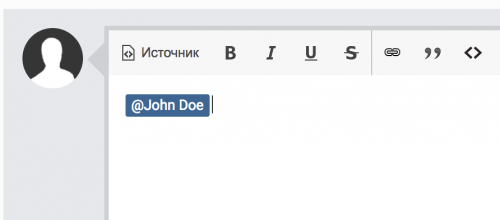
This plugin adds a new button to every post which allows you easily mention users by putting their names into the reply text area. Supports forum topics and comments (e.g. Blogs, Gallery). \ -
can you x-splain this a little more better because when doing this it dont really tell what to remove what to do here in these lines what i'm asking is what do you remove in Widgets.php what is in there know or just add it under the codes all ready every thing else i did there Applications >> Core >> Modules >> Front >> System >> and edit Widgets.php On these lines add your widget name: Line: 33 if ( ! \IPS\Member::loggedIn()->modPermission('can_manage_sidebar', 'can_manage_WIDGET NAME') Line 35: \IPS\Output::i()->error( 'no_permission_manage_sidebar', 'no_permission_manage_WIDGET NAME', '3S172/1', 403, '' ); Line 75: if ( ! $block->isExecutableByApp( array( \IPS\Request::i()->pageApp, 'sidebar', 'WIDGET NAME' ) ) ) Line 236: if( !in_array( \IPS\Request::i()->area, array( 'sidebar', 'WIDGET NAME' , 'header', 'footer' ) ) ) once you have made those changes save the widgets.php and overwrite the file.
-

IPS 4.x Navigation Menu Bar/Links Workaround (HTML/CSS)
mr-pimpen replied to tempest21's topic in IC4 Guides
yea i did it worked -
IPS 4.x Navigation Menu Bar/Links Workaround (HTML/CSS)
mr-pimpen replied to tempest21's topic in IC4 Guides
this is giving a bad redirect issues when trying to add the codes to the templet or maybe im doing something rung nver mind got it its ok not for me sorry -
ok good
-
its in that line that i add just change the color
-
<span style="background: url(public/Image/bubbles.gif); color: #55d820; font-weight: bold; text-shadow: 0 0 .9em #ffffff;"Baddog-11</span> this will work just add the url to the image and dont change anything else
-
just look for t-man and change to what you want but dont delete it its part of the ticker if you need to change it and need the editor here is the link Intelligent HTML, CSS, JavaScript editor
-
this will let you put an image to the top navigation bar and users link #elUserNav { background-color: #2D2D2D; background: url(https://www.website.com/Image will go here); padding: 2px 15px; border-radius: 2px; right: 15px !important; } #elUserLink_menu { border: 2px solid black; padding: 1px; background: url(https://www.website.com/Image will go here); background-repeat: no-repeat; background-origin: content-box; } 100%
-
is the a way that you guys can add the clear notification on here so we can clear the message
-
that chages the color not hover the back round
-
hover color css code ul:not( .ipsMenu_keyNav ) .ipsMenu_item:not( .ipsMenu_itemClicked ):not( .ipsMenu_itemDisabled ) a:hover, .ipsMenu_item[data-selected] a, .ipsMenu_item[data-selected] span, .ipsMenu_item.ipsMenu_hover { background: red; } .ipsMenu_title { background: green; }
-
Leaderboard tabs background .ipsTabs_activeItem:hover{ background: #003765!important ; color: green!important } a.ipsTabs_activeItem, .ipsTabs_activeItem { background: green; } .ipsTabs_item { background: green; }
-
the profile link in the theme not working correct needs to be fix but the theme is great
-
works perfect
-
read them
-
mr-pimpen what every one