Advertisement


roceed
-
Posts
1 -
Joined
-
Last visited
-
Days Won
2
Recent Profile Visitors
662 profile views


roceed's Achievements
")


-

Version 1.0.1
103 downloads
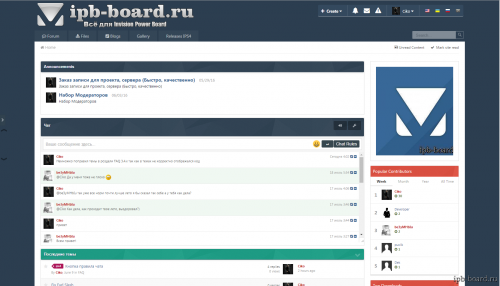
Skin Flat IPS4. Author: Ciko (IPB-Board.ru) Added button up / down Fixed chat category get out Posted in Font Awesome Icons button PageHeader added to the frame! (Moderate, Post Thread) added to the frame! Chat Rules How to add a button to the chat Go to: bimchatbox-chat-chatform to find: <button type="submit" class="ipsButton ipsButton_primary ipsButton_verySmall" data-action="chat" id="chat_button"><span class="ipsType_small"><i class="fa fa-level-down fa-rotate-90"></i></span></button> The following add: <label class="btn" for="modal-1">Chat Rules</label> <div class="modal"> <input class="modal-open" id="modal-1" type="checkbox" hidden> <div class="modal-wrap" aria-hidden="true" role="dialog"> <label class="modal-overlay" for="modal-1"></label> <div class="modal-dialog"> <div class="modal-header"> <h2><div class='ipsMessage ipsMessage_error'> Forbidden </div></h2> </div> <div class="modal-body"> <p>1) It is forbidden to write in chat using.</p> <p>2) Prohibited links to external sites.</p> <p>3) Sending messages with restricted content.</p> </div> <div class="modal-footer"> <label class="btn btn-primary" for="modal-1">Close</label> </div> </div> </div> </div> Go to: custom.css add to the bottom: .modal-header h2 { color: #555; font-size: 30px; font-weight: normal; line-height: 1; margin: 0; } .modal .btn-close { color: #aaa; cursor: pointer; font-size: 10px; text-decoration: none; position: absolute; right: 5px; top: 0; } .modal .btn-close:hover { color: red; } .modal-wrap:before { content: ""; display: none; background: rgba(0, 0, 0, .3); position: fixed; top: 0; left: 0; right: 0; bottom: 0; z-index: 101; } .modal-overlay { bottom: 0; display: none; left: 0; position: fixed; right: 0; top: 0; z-index: 102; } .modal-open:checked ~ .modal-wrap:before, .modal-open:checked ~ .modal-wrap .modal-overlay { display: block; } .modal-open:checked ~ .modal-wrap .modal-dialog { -webkit-transform: translate(-50%, 0); -ms-transform: translate(-50%, 0); -o-transform: translate(-50%, 0); transform: translate(-50%, 0); top: 20%; } .modal-dialog { background: #fefefe; border: none; border-radius: 5px; position: fixed; width: 80%; max-width: 500px; left: 50%; top: -100%; -webkit-box-shadow: 0 15px 20px rgba(0,0,0,.22),0 19px 60px rgba(0,0,0,.3); -moz-box-shadow: 0 15px 20px rgba(0,0,0,.22),0 19px 60px rgba(0,0,0,.3); box-shadow: 0 15px 20px rgba(0,0,0,.22),0 19px 60px rgba(0,0,0,.3); -webkit-transform: translate(-50%, -500%); -ms-transform: translate(-50%, -500%); -o-transform: translate(-50%, -500%); transform: translate(-50%, -500%); -webkit-transition: -webkit-transform 0.4s ease-out; -moz-transition: -moz-transform 0.4s ease-out; -o-transition: -o-transform 0.4s ease-out; transition: transform 0.4s ease-out; z-index: 103; } .modal-body { padding: 20px; } .modal-body p { margin: 0; } .modal-header, .modal-footer { padding: 20px 20px; } .modal-header { border-bottom: #eaeaea solid 1px; } .modal-header h2 { font-size: 20px; margin: 0; } .modal-footer { border-top: #eaeaea solid 1px; text-align: right; } .modal-body img { max-width: 100%; height: auto; } .btn { background: #37474f; color: #fff; border-radius: 3px; cursor: pointer; right: 2px; bottom: 0px; display: inline-block; font-size: 12px; padding: 4px 8px; text-decoration: none; text-align: center; min-width: 10px; position: relative; } .btn-primary { background: #428bca; border-color: #357ebd; color: #fff; } .btn-primary:hover{ background: #66A1D3; } .cbItems img { margin-right: 2px; } Icons in the profile menu- 1 review
-
- 3
-